Quantitative PICK Chart
Executive Summary
The PICK chart is a well-known project selection tool, often used by Six Sigma practitioners to whittle down a list of potential projects. It is usually used during a brainstorming session to help select a project from among a group of project ideas. By its nature, the PICK chart is qualitative. This paper explains the benefits of using a quantitative PICK chart and explores the issues inherent in quantifying the PICK chart.
The Standard PICK Chart
PICK Charts are normally created during a brainstorming meeting with a group of stakeholders. To create a PICK Chart, the meeting facilitator will create a two-by-two matrix, usually on a white board or a large sheet of paper. This matrix will be labeled with an attribute across the bottom, for instance payoff, with low payoff in the one column and high payoff in the other column. A second attribute will be assigned to the rows, such as easy to implement and hard to implement.
The individuals in the group will then write project ideas on sticky-notes and place them in one of the four quadrants. There is usually some debate about placement but, by the end of the exercise, each sticky-note is in one of the quadrants. The quadrant labeled as easy to implement with a high payoff is called the Implement quadrant; the hard to implement and low payoff quadrant is called the Kill quadrant. And, the other two quadrants are considered Possible or Consider, depending on how the board is laid out.
See figure 1 for an example PICK chart layout.

Figure 1
The Quantitative PICK Chart
The standard PICK Chart gets its power from how easy it is to create and understand. Just looking at the chart, with no training, most people would be able to select the group of projects that are the best ones to consider.
The quantitative PICK Chart, or QICK Chart, which is pronounced like KICK, takes more work to create and has some differences in how it is interpreted, but it is still fairly easy to grasp. Instead of placing each project into a quadrant of a 2-by-2 matrix, we assign values for each axis to each of the projects. For example, instead of saying a project is easy and has a high payoff, we could describe the project as having a rating for ease of execution of 8, on a scale from 0 to 10, with high numbers being easy, and a rating of 7 for payoff.
The team would assign a pair of values to each project and then plot the data on a standard scatter diagram, as shown in figure 2.
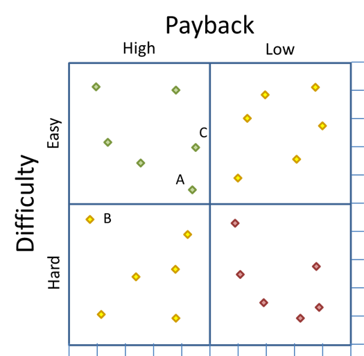
Figure 2
The quantitative PICK chart is obviously not a replacement for the standard PICK chart because, while the standard PICK chart is easy to create, easy to understand, and requires virtually no training, the quantitative PICK chart needs data that can be converted to indices and is not quite as intuitive. In fact, the quantitative chart requires a new way of interpreting the data because the four quadrants system breaks down when the data is quantified.
Consider data points A, B, and C in figure 2. Points A and C are both in the “Implement” quadrant, and point B is in the “Consider” quadrant. However, point B is just a little south of point A, which means it is just a little more difficult. But B is a significant distance to the left of A, which means it has a much higher payoff. In other words, the ratio of difficulty to payback is better for point B than for point A, even though A is in the implement quadrant and point B is not.
The same thing could be said when comparing an item in the upper left corner of the “Kill” quadrant to the lower right corner of the “Possible” quadrant. The item in the “Kill” quadrant may actually be a better option than the item in the “Possible” quadrant.
Because of this anomaly, a new way to analyze these data is needed. This leads us to the creation and use of a dipolar scatter diagram.
Dipolar scatter diagram
Dipolar is a physics term meaning, “a pair of electric point charges or magnetic poles of equal magnitude and opposite signs.” Most scatter diagrams simply plot XY data and are used to find a correlation between the X and Y values.
A dipolar scatter diagram still plots the data on the X and Y axes, but it has one corner defined as “good” and the opposite corner defined as “bad.” For instance, in our example, the best project to consider would be the one that is closest to having the best payoff and highest ease of implementation—in other words, as close to the upper left corner as possible. (As a side note, if both poles are equally good, the chart would be a bipolar chart.)
In figure 3, below, two arcs have been added to the image from figure 2. These arcs are created by layering on a circle with its center point at the corner of the matrix, and a radius equal to the height and width of one quadrant—or half the height and width of the matrix. One of these arcs, in green, is the “good”, or implement, arc and the other, in red, is the “bad”, or kill, arc.
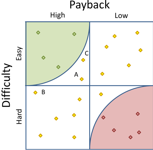
Figure 3
Notice that the arcs make it much easier to measure the distance from the nearest pole. Figure 3 makes it clear that there are four points in the Implement area and five in the Kill area. It also becomes a clear that our old friend data point B is closer to the corner than data point A.
In fact, we could actually make the arc a little bigger to make data point B fall within the radius—see figure 5, below. Three logical possibilities for the size of the arcs are:
- A radius equal to quadrant width, as seen in figure 3. This is the most conservative view and includes a subset of projects that fall into the “good” quadrant.
- A radius reaching to the center point, as seen in figure 4. This radius is the most aggressive and does not exclude any items that appear in the “good” quadrant, but adds those items in the other two quadrants that are as close as the center point.
- A radius set such that the inner area of the arc equals one-fourth of the total grid area, as seen in Figure 5. This radius is between the conservative and aggressive radii. The “good”, or Implement, arc covers the same area as the original “good”, or Implement, quadrant.
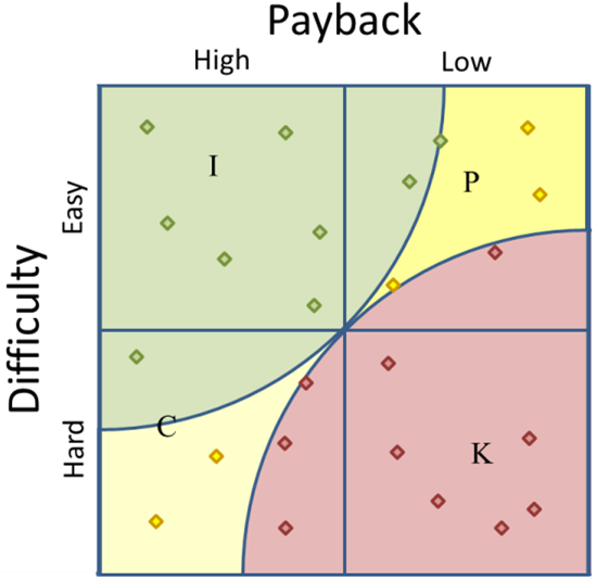
Figure 4
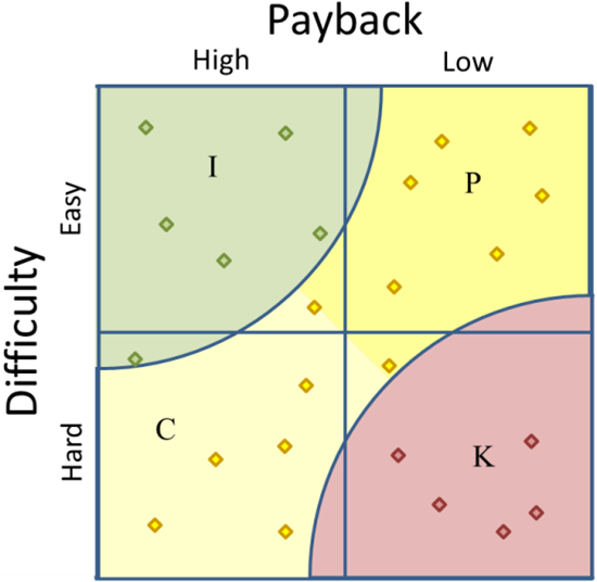
Figure 5
In these examples we have also added shading to differentiate between Possible and Consider. However, it is not strictly needed unless some specific application requires this distinction.
Plotting your data
Plotting the data is a little more complicated than just plotting the raw data because the objective is to compare the data points to each other, not relative to a pre-defined absolute. If all of your projects have payoffs between $100,000 and $900,000, we don’t want the axis to begin at $0 because that will skew the results, unless the top axis value is set appropriately. The best solution is to convert the data to indices.
Data for the X axis represents the payoff for the project. This could be determined in any number of ways, including:
- Payback Years (the number of years it would take to pay back the cost of the project with the savings the results of the project creates.)
- Net present value for a series of cash flows
- Savings over a fixed period of time, e.g., 10 years, less the cost of implementing the project.
Keep in mind that what you use is less important than using the same calculation for all of your data points.
When plotting your data, it might make the most sense to convert it to an index from 0 to 10, as mentioned earlier. To do this, find the lowest value and the highest value; then subtract the lowest from the highest to get the range. Once you have the range, subtract this value from each of the other data points, then divide that result by the range.
For instance, to create the spreadsheet in Figure 6, which converts a list of payoffs to indices, use the formulas below.
B1: =MAX(A6:A15)
B2: =MIN(A6:A15)
B3: =B1-B2
B6: =A6-$B$2
C6: =(B6/$B$3)*10
Copy B6 and C6 down so you have one row for each data point, then enter you data in column A starting in row 6. Make sure to adjust any ranges to fit your needs, especially make sure the formulas in B1 and B2 include all of your data.
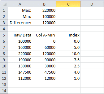
Figure 6
This process will give you the data for the X axis of your scatter diagram. To get the Y axis, you would follow the same process with some kind of data that reflects how easy it is. Possibilities include:
- An estimate for the number of person-months to complete the project
- A rating from 1 to 10 based upon past projects. (This is not true quantitative data, but at least it is strong qualitative data.)
- An estimate of the investment required to implement the project.
Again, consistency is what is important.
Once X and Y index values are created for each project, plot the data on an XY Scatter Chart. Since Excel doesn’t support a Dipolar scatter chart, you will then have to draw the arcs using a protractor or an Excel drawing object.
Conclusion
There will obviously be times when a standard, qualitative PICK chart is the right tool. The PICK chart is excellent when a large group of stakeholders want a simple way to classify projects. The PICK chart is fast, easy to create, simple to understand. However, there are times when data is available, or could be created, that allow each project to be placed on the chart more precisely. And, when this is done, it is important to use a dipolar scatter diagram in order to interpret the results properly.
Bibliography
PICK Charts and Kaizen by Derek Huether; The Critical Path
Use a Pick Chart to Make Better Decisions; Rapid-Business-Intelligence-Success.com


